Role: Creative Director
Eddie Bauer came to us to help celebrate their upcoming centennial (2020) and create an end-to-end 360 campaign that promoted and encouraged everyone to spend time outside.
Our work started with the creation of the 100yr logo mark, visual identifiers and taglines, and concepting for a full year of consumer touchpoints. This included TV ads, limited edition apparel, an experiential mobile tour, pop-up mall experiences, store window displays and a full social media campaign and strategy.
Below are a few scattered examples of some of the tactics and touchpoints we had developed to activate in 2020. Unfortunately, with the Pandemic, we had to shelf most of the experiential work, but Eddie Bauer still rolled out all the identity and social work we produced.
Creative Team Credits:
Creative Direction: Dan Richards, Luis Infante
Copywriting: Amanda Wheeler
Art Direction: Rachel Roebuck
3D Design: Jammy Chong, Emily Pasternack
UX/Dev: Brian Peters
“Find Yourself Outside” Concept Video
Campaign Key Visual
Graphic visual treatments
Centennial mark exploration
Final logo mark
Example of logo mark used in apparel ads
Digital banners and ad toolkit
Eddie Bauer Guides Ad
We wanted to kick off the campaign with a big statement - bringing the night sky (via projection) to a city center that doesn’t get to see it often.
Another big campaign idea, creating a 100yr flagship store in the middle of a forrest for hikers to find, where everything inside is 100% off.
Mobile tour - Truck design, closed
Mobile tour -Truck design, open
Mobile tour -Truck design, interior
Mall pop-up initial design
Mall pop-up final design
Mall pop-up photos
Original pitch for what became Eddie Bauer’s yearly “Sleep Under the Stars” celebration (We called it Camp Eddie)
Role: Creative Director
In 2020, Artistry asked us to help them launch their brand-new Gen-Z-targeted skincare line, “Artistry Studio Skin”. The campaign needed to be bold, fun and empowering - executed primarily in social media and partnering with influencers, with an added virtual event component.
We came up with the campaign slogan “Let Your Glow Show”, which became a rallying cry to Gen-z-ers to embrace and celebrate their uniqueness, and let the world see and love them for who they really are. We designed the look of the campaign to take on the same look of fun, irreverence and energy for life.
We conducted product and model photo shoots to create an asset library, deployed a full pre-launch, launch and post-launch social media campaign, and hosted a 2-day virtual “retreat” with influencers and product experts leading events and classes based on the new products.
The campaign was a big success, getting us a Gold Distinction at the Shorty Award this year. We have since launched six new product lines for Artistry and continue to work together to provide engaging social media content for their audience.
Creative Team Credits:
Creative Direction: Luis Infante, Colin Booth
Copywriting: Adeline Berger, Colin Booth
Art Direction: David Acosta
Graphic Design: Sarah Pinrut
Let Your Glow Show - Campaign recap video
Pre-launch social assets sample, posted on Instagram teasing the natural ingredients on the products to come.
Product photography samples
Model photography samples
Product photography samples
Model photography samples
Product photography samples
Model photography samples
Samples of the full social media pre, launch and post-launch creative
Instagram home page design and Story assets
Recap of the 2-day “Virtual retreat”
Kit sent to influencers to open and show off on social media
Release video later in the year, announcing new products being added to the line.
Your coffee routine says a lot about you. Not just what you like, but who you are.
As our Starbucks Rewards Members continue to make Starbucks an essential part of their day-to-day life, we wanted them to feel seen, heard and understood at every touchpoint —celebrated as individuals and recognized as part of something bigger, all through the lens of their Starbucks routine.
This Starbuck Blend digital experience invited loyalty members to explore their unique Starbucks Blend based on their past year’s purchasing habits and receive their very own “Coffee Card” - a piece of custom digital art based on their unique data. As their blend unfolds, we revealed a unique pattern and persona name that represents their year and completed their coffee card. The finished art felt fun, ownable and shareable—a fun representation of the past year that built excitement for the year ahead.
Creative Team Credits:
Creative Direction: Luis Infante, Gary Jacobson
Copywriting: Maria McNamara
Art Direction: London Dewey
Graphic Design: Charlotte Offin, Sarah Pinrut
Program lockup design
Coffee Card unique designs
Expression patterns
30+ unique icons designed to customize members Coffee Cards
Experience walk through
Final Coffee Card
Role: Creative Director
This was a blue-sky campaign project we did for Capital One in 2022 as a way to pitch (and win) the Capital One Café business.
The ask was to create a 360 campaign that drove awareness about Capital One Cafes around the holiday season and create exciting events in-Café to drive repeat visits. We also had to balance credit card/banking messaging for consumers once in store.
We came up with the Capital ONEderland, transforming each Café into a winter wonderland of possibilities.
The concept was grounded in physical experiences, and using projection mapping in-Cafe to create indoor immersive lights/music shows daily for the whole family. From that, we derived a whimsical key visual of oversized holiday patterns and textures, and used the iconic Capital One Café coffee cup as the focal point.
Creative Team Credits:
Creative Direction: Luis Infante, James Hough, Eric Sutton
Copywriting: James Hough, Bea Pasts
Art Direction: Sarah Pinrut, Luis Infante
3D Design: Travis Brown
An assortment of campaign visuals
Out of home example
Window displays
The Capital ONEderland during regular hours
Capital ONEderland during an show night - Projection mapping changes the entire feel of the flagship store.
Email communication sample
In-store campaign collateral
Credit card messaging
Hulu ad example
Social photo ops
Role: Creative Director
In 2018, PUMA came to us asking to reinvent their Team Faster Summit, which happens every year, but had in past years lost some of the hype and buzz around the event. The goal was to create a trainer-focused, super trendy, content-generating hub for the 200+ PUMA trainers attending.
Our team focused on three aspects: a cool location, a bad-ass space, and making the experience as shareable as possible. So we took over a warehouse space in South Beach for the Art Basel Festival in Miami, and created a hyper-instagramable space to host the three day event, bringing in celebrities like Usain Bolt and Adriana Lima to elevate the experience.
We worked closely with Puma Boston and their headquarters in Germany to bring to life the space design, all experiences, graphics and branded assets. We also developed an app that enabled trainers to share pics with each other, host livestreams, and access their schedules.
What resulted was a memorable experience for all involved, generating over 1.5million social impressions, and a 250% increase in @Puma mentions on social over the previous year’s summit.
Creative Team Credits:
Creative Direction: Luis Infante
Copywriting: Amanda Wheeler
3D Design: Jammy Chong
2D Design: Jake Dickey, Jasmin Nguyen
Event recap video
Graphic look and feel for the space
Initial concept sketch for the pitch. We envisioned a multi-layered space filled with energy, music and motion. A cross between a fashion show and a gym.
Rendering of entry portal - Made from over 500 iconic red Puma shoe boxes
Photo of entry portal
Rendering of main workout space
Photo of main workout space
Rendering of weight room
Photo of weight room
Rendering of lounge space
Photo ops
Photo ops
Photo ops
Last day with all the trainers
Role: Creative Director
In 2021, Edward Jones asked us to create and bring to life a campaign for their 100 year anniversary (in 2022). Deliverables included conceptual direction, campaign art direction, centennial identity/branding, as well as a comprehensive year-round celebration calendar filled with multiple tactics that had to reach their over 50,000 associates throughout the year.
Our concept became “Lighting the Way” - A way of showing that even through tough times, Edward Jones has always been a beacon of light that shines through countless communities across the US and Canada. Once we had our concept, we began ideating the year-long campaign reaching associates via digital, social and experiential.
Some of the bigger campaign tentpole moments included a “teaser” video to get associates excited about the celebration to come, a massive virtual event (The Beacon) watched by over 30,000 associates, a series of Ted-talk-like talks with executives, and a Centennial Celebration Tour: an experiential tour with 6 stops across the US and Canada hosting more than 800 associates per stop.
Creative Team Credits:
Creative Direction: Luis Infante, Brian Fudge
Copywriting: Pea Pasts, Brian Fudge
Art Direction: Luis Infante, Sarah Pinrut
3D Design: Travis Brown
Teaser for campaign look in November 2021, before its launched in January 2022
Motion graphics
Roadmap for the full centennial campaign
The Beacon - Keynote to kick off the centennial celebration
Entrance tunnel detail shot
Entrance tunnel
360 digital gallery
360 digital gallery - interior
360 Gallery content
Main stage
Seating areas
Centennial photo op
Branded lawn games
Grand finale - Drone show
Role: Creative Director
Amazon asked us to help them create fun and bold pop-up spaces for participating brands at their Amazon Hub/Lockers stores located in colleges across the country. This activation was a partnership between Amazon and Old Spice Hair Care, who wanted to promote and educate students on their six different product offerings.
We created a barbershop themed pop-up based on the idea of customization. After all, it’s called a hairstyle — emphasis on “style”.
Students could explore the different product offerings, learn about their benefits, and even see how the hairstyles would look on them.
The centerpiece of the experience was a product wheel, where each spin would highlight a different product, and showcase product info and matching achievable hairstyles.
Creative Team Credits:
Creative Direction: Luis Infante, Brian Fudge
Copywriting: Beatrice Pasts (CW) , Brian Fudge (CD)
Design/Art: Luis Infante (CD), Jammy Chong (3D Designer)
UX/Dev: Ethan May (UX Designer)
Recap video
Internal directional sketch
Concept rendering
Final design rendering
Detail shot
Final space
Product wall - Detail shot
College students engaging with the product wheel
Scanning QR code to redeem Amazon discount code
Product bar
Detail shot
Final space
Artistry came to us seeking help in revealing and launching their all new line of natural beauty products called Artistry Skin Nutrition. This new launch represents a massive pivot for Artistry to go all-in on natural, vegan, paraben free and never tested on animals skincare products.
We leveraged the event’s timing to celebrate Spring as a catalyst for life, growth and change, and frame Artistry Skin Nutrition as the full blossom of the current Artistry brand. This allowed us to seamlessly tell the purity of ingredients story that made the Artistry Skin Nutrition portfolio so powerful.
The campaign included a pre-launch virtual event with the top reps, as well as a customer-facing social tease/reveal campaign with two weeks worth of social content including posts, stories, a launch video as well as influencer unboxing and reaction for which we designed unique product kits.
Creative Team Credits:
Creative Direction: Luis Infante
Copywriting: Shelby Tansil
Art Direction: Luis Infante, Sarah Pinrut
Graphic Design: Sarah Pinrut
Campaign Video
Concept mood board
Tease phase - Instagram profile reskin and tease posts
Tease phase - Day before Instagram stories
Teaser video (released the day before launch)
Release video on launch day
Launch social content
Amway site takeover
Hydrate influencer kit
Balance influencer kit
Renew +Firm influencer kit
Role: Creative Director
Amazon asked us to help them create fun and bold pop-up spaces for participating brands at their Amazon Hub/Lockers stores located in colleges across the country. Our first activation was a partnership between Amazon and Philips, who wanted to promote their college tier of products: The Philips OneBlade and Philips One electric toothbrush.
We named our concept “A degree In Clean”. It revolved around creating a vibrant collegiate-style space, where students could pop in and learn about the two product lines. Tying the concept together was Professor Phil. A pre-recorded virtual professor who would engage with guests in the space through a series of loops and fun engagements. He would grab student’s attention and direct them to either wall, where they could take a quiz to get their “Degree in Clean” as well as a 20% “credit” towards their Philips purchase.
This highly visual experience helped Philips become top of mind for college students, and directed them to the Philips store on Amazon where they could easily get their next electric razor or toothbrush.
Team Credits:
Creative Direction: Luis Infante, Brian Fudge
Copywriting: Beatrice Pasts (CW) , Brian Fudge (CD)
Design/Art: Luis Infante (CD), Jammy Chong (3D Designer)
UX/Dev: Ethan May (UX Designer)
Recap video
Internal directional sketch
Concept rendering
Final space
Professor Phil - Loop and sketch examples
Philips One quiz UI
OneBlade quiz UI
Detail shots
College students taking selfies with Prof. Phil
Philips One (Sonicare) quiz wall
Detail shots
Quiz wall
Detail shot
Final space
Role: Lead 3D Designer
I was part of the retail design team at FITCH that created and developed the concept of City Target. At the time, taking a big box store to an urban environment in the US was unheard of.
Through a discovery and design phase that took the FITCH and Target teams through a trip across Europe, we collected inspiration and landed on the design principles that would make up the City Target prototype stores (Seattle and Chicago).
We delivered the experience from soup to nuts - from a brand new City Target logo and identity, to more efficient space plans that would bring only the essentials to urban shoppers, to a simplified and modern navigation and communication graphics system.
As Lead 3D Designer, I developed the final store layouts, designed the endcap and in-aisle experiences, and helped develop the environmental graphics system. I also was responsible for visualizing all store elements in render form.
Creative Team Credits:
Creative Direction: Christian Davies, Brandon Page
3D Design: Luis Infante, Erin Wilson
Art Direction: Brandon Page, Brian Connell
Role: Creative Director
In 2019, Wayfair came to us wanting to design and roll out their first ever physical store for the holiday season. This prototype would serve as testing grounds for Wayfair’s future brick and mortar initiatives. They wanted to display as much product as possible and create home “vignettes” that could organically showcase it all.
Using the Wayfair logo as a guide, we divided the space into four “houses”: Living room, Renovation, Kitchen/Dining and Bedroom. To reinforce the design concept, we took the shape of the logo’s “houses” into the vertical space to create a recognizable and familiar house shape. This created the main steel structure of the pop-up, and served as the frame to hang modular walls and displays. These could be easily moved around and rearranged for future use.
In the center of the pop-up, we created a small but useful design services space, where Wayfair associates could help guests with questions or design selections.
Creative Team Credits:
Creative Direction: Luis Infante
3D Design: Jammy Chong, Dana Wait
2D Design: Jasmin Nguyen
Floor plan inspired by the Wayfair logo with each “house creating a different vignette
Fly through animation of the space
Living room vignette
Renovation vignette
Kitchen vignette
Bedroom vignette
Role: Lead Architectural Designer
Buffalo Wild Wings came to us asking for a ground-up brand refresh, which included a new identity, tone of voice and redesigned restaurant prototype. I worked under the group CD, leading the environmental design work, working closely with graphic designers and copywriters.
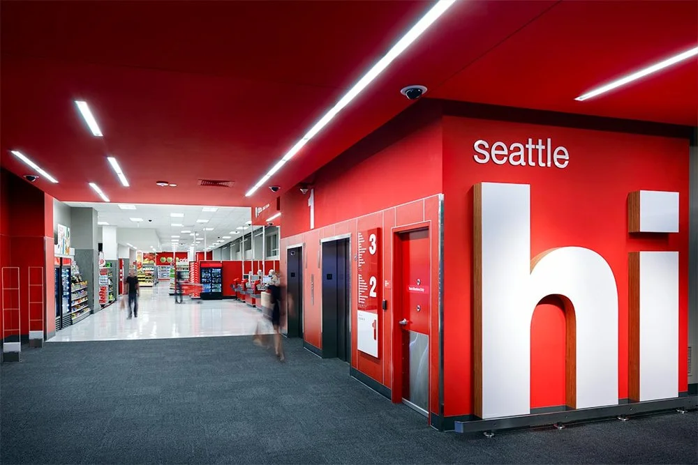
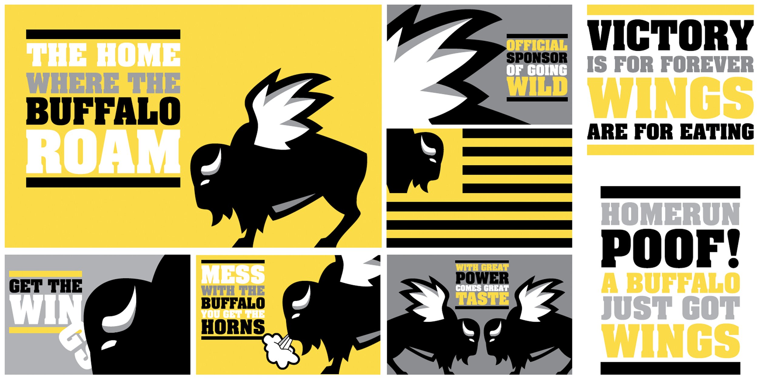
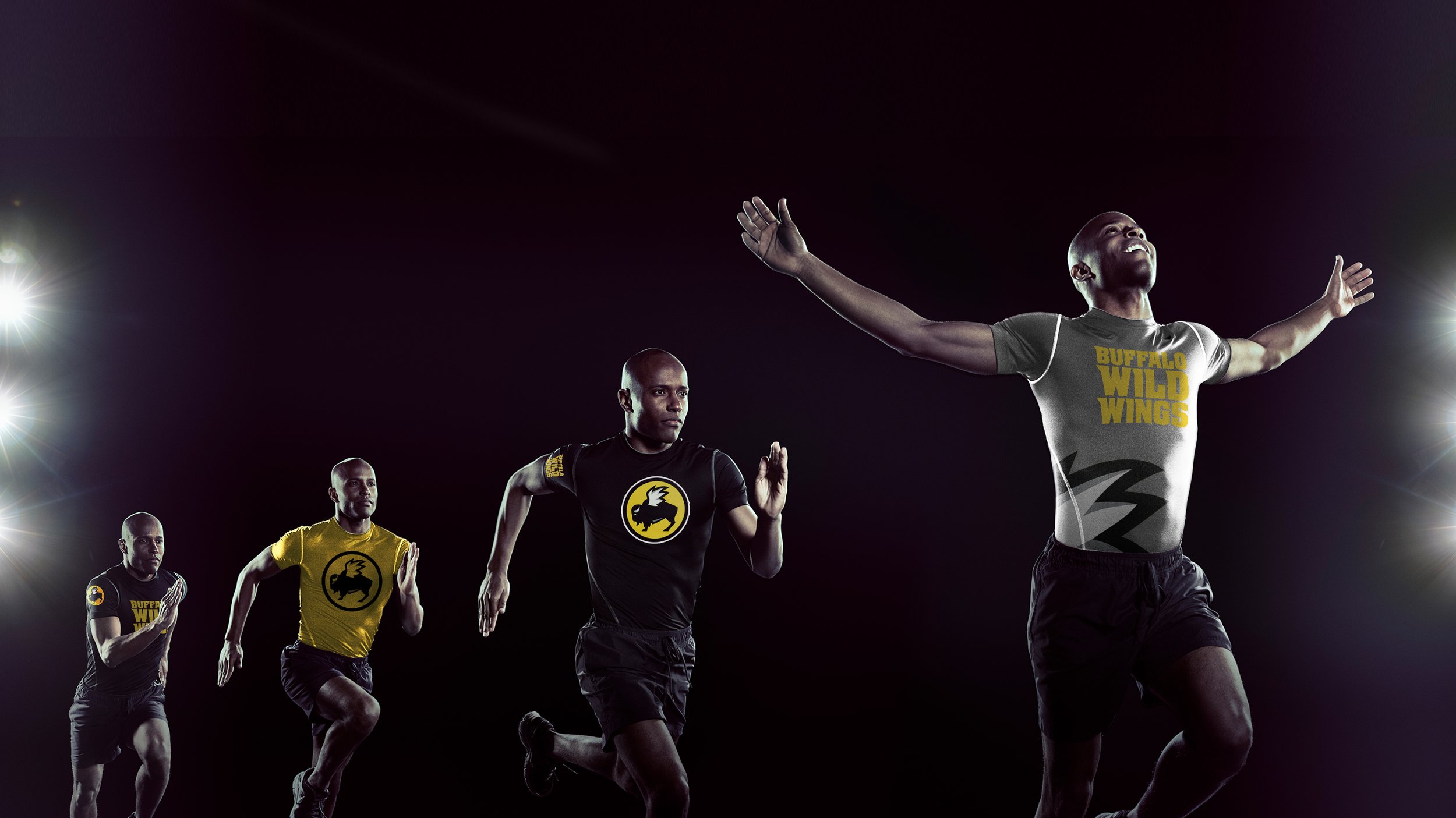
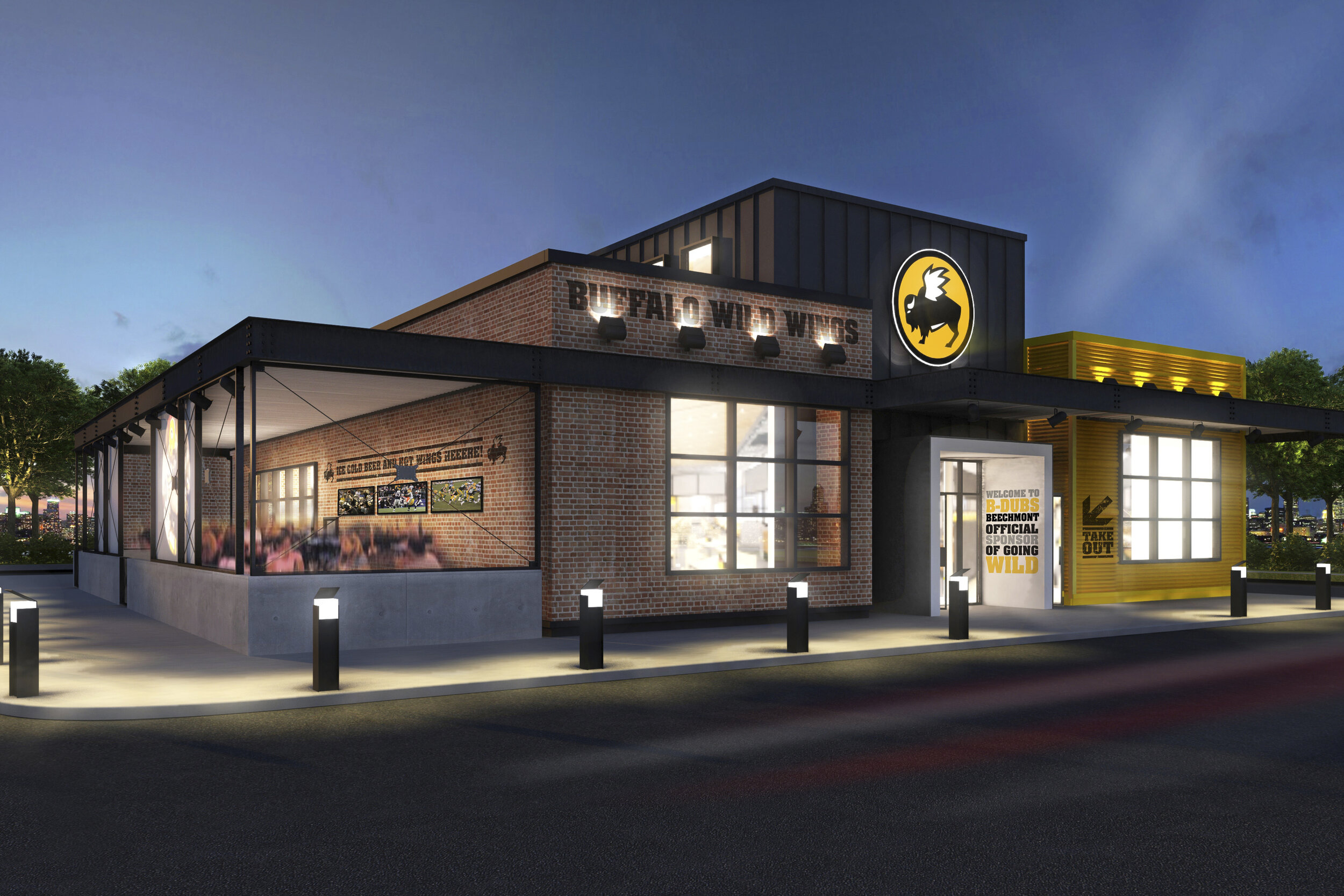
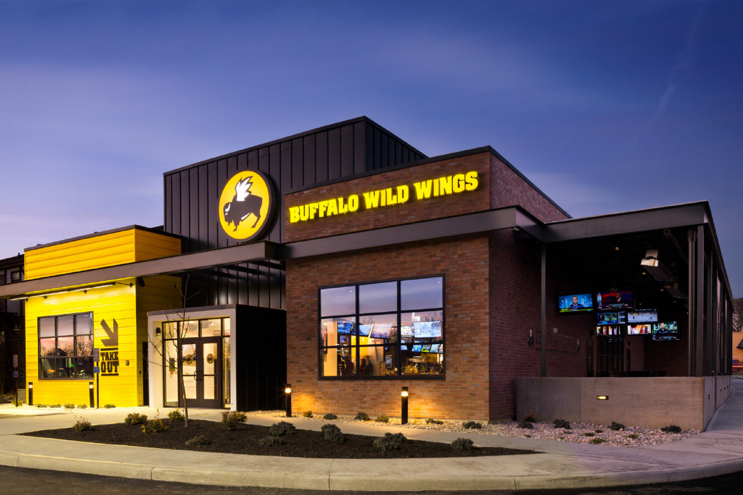
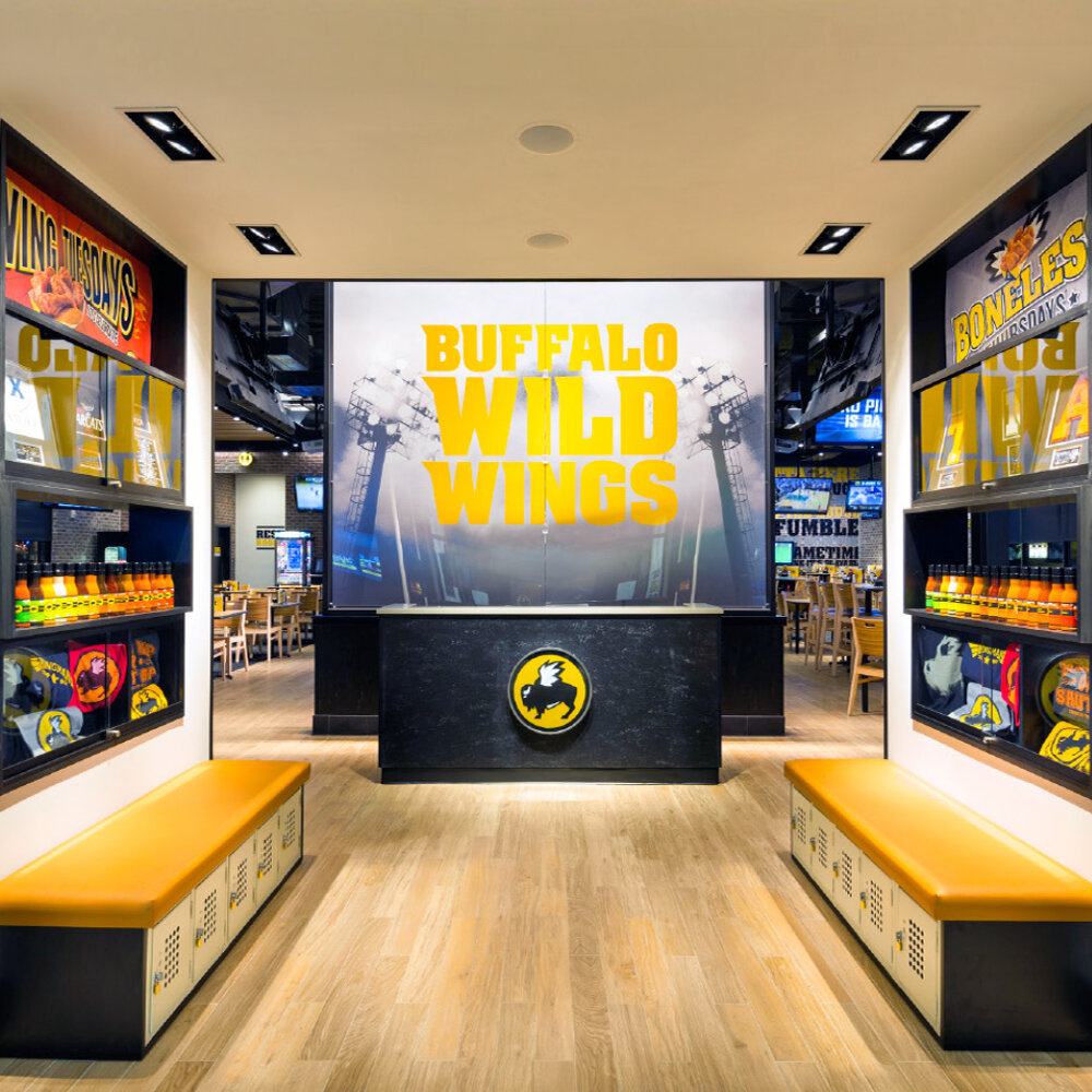
The brief called for a space that was bright, buzzing with energy and welcoming to all - a big departure from the dim lit, dark restaurants they had in the past. The first thought we had as a team was “It has to be a stadium”. No matter the sport, this is a stadium experience for all, bringing the fun, loud and energetic atmosphere to fans all over.
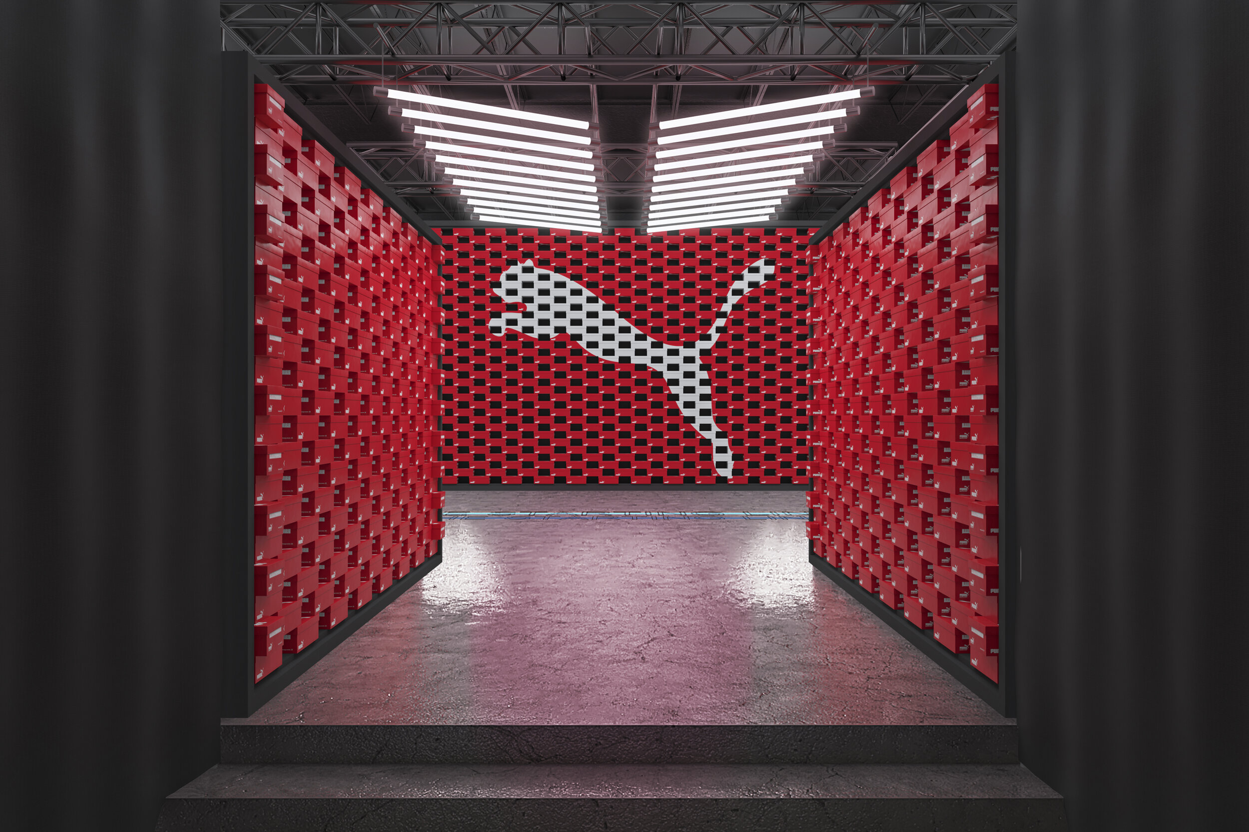
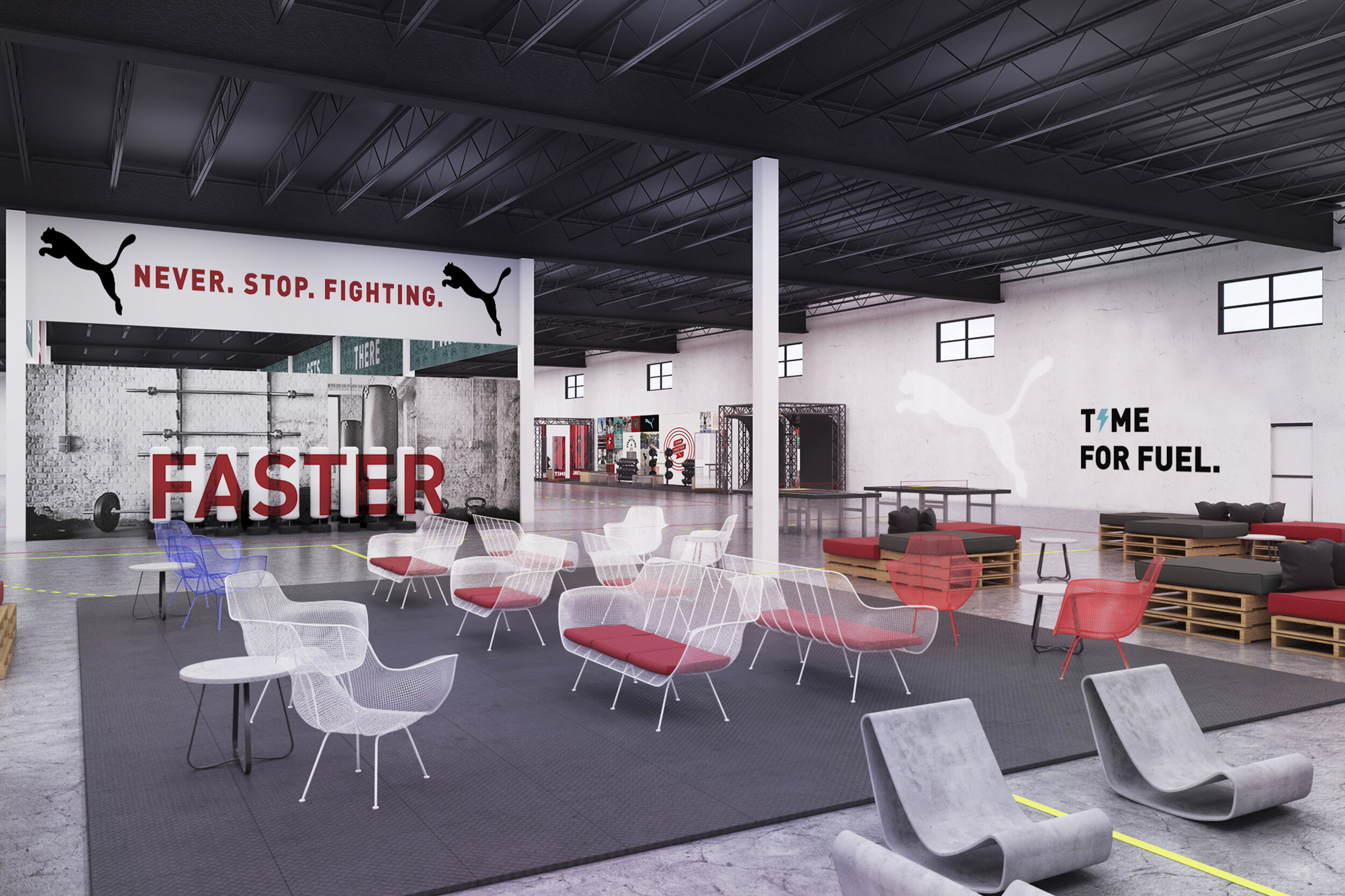
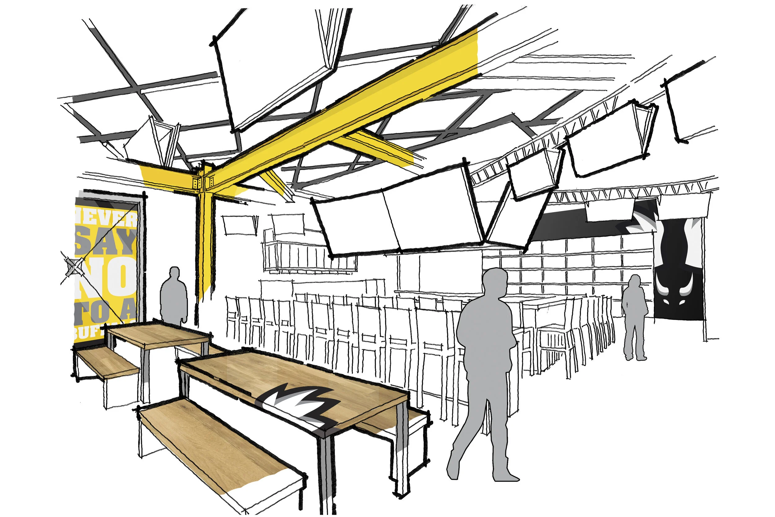
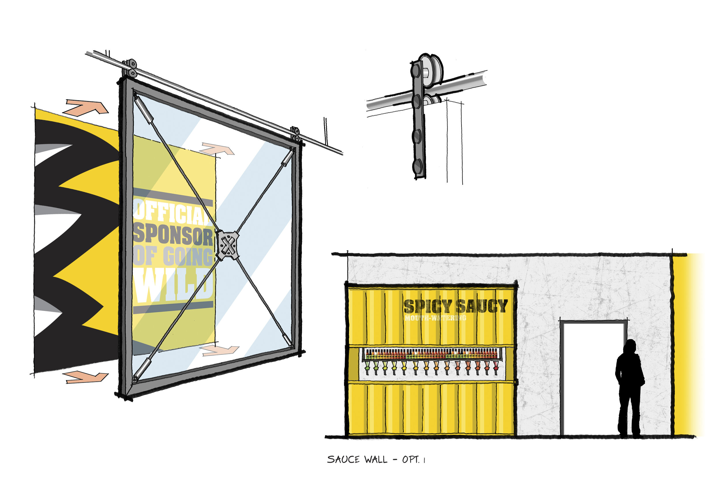
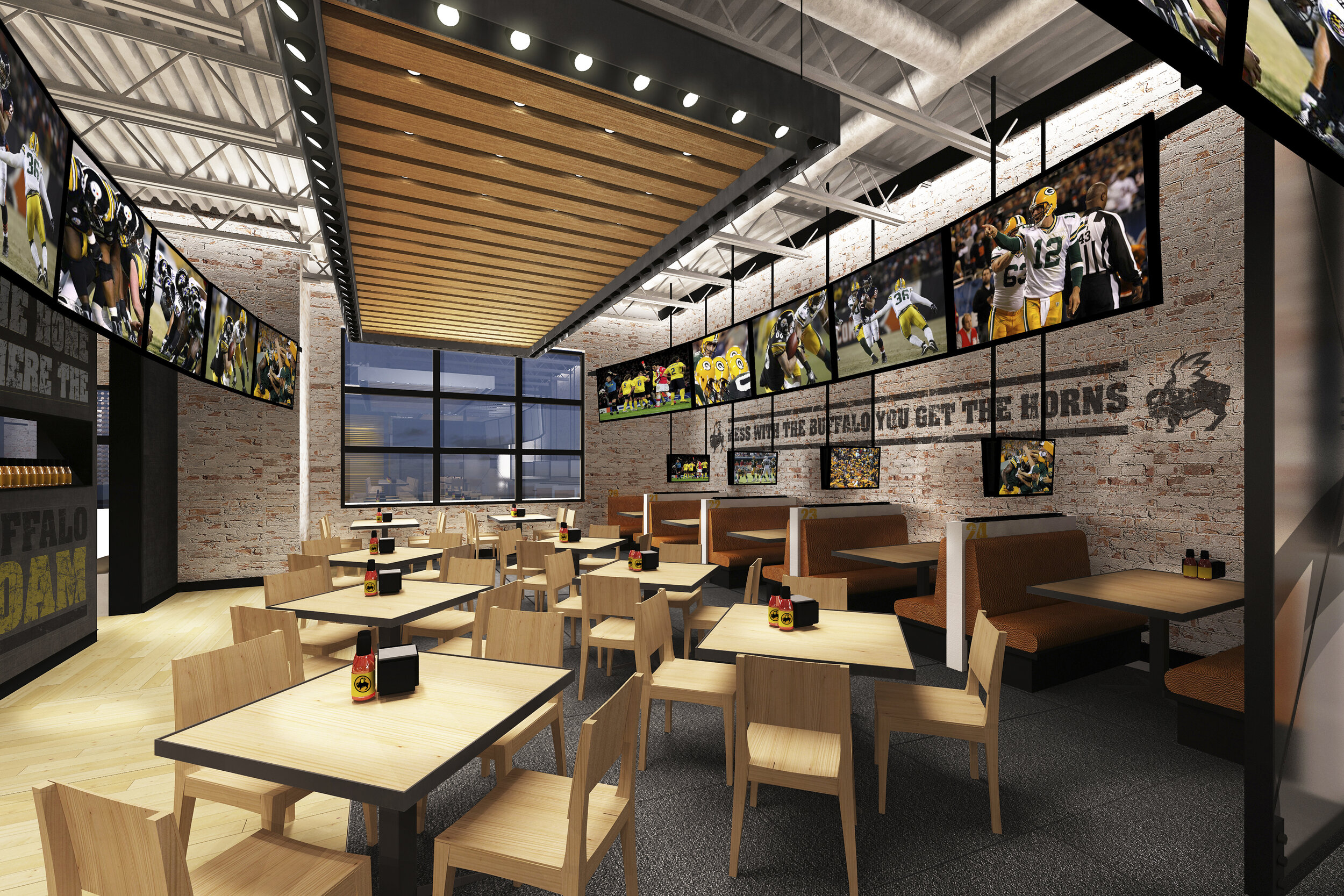
The customer enters the restaurant through a series of metal portals resembling player locker rooms and stadium tunnels. As they enter the main space, the low ceiling of the portal opens up to reveal a two story high mega bar with an enormous twelve foot jumbotron. The space is industrial and modern yet warm and accommodating. Wood, metal and brick contrast bright, bold graphics with a fun and bold tone of voice.
Family dining is more calm and quiet while still exposing everyone to a ridiculous amount of TV screens and live score updates. The ceilings are lower providing a more relaxed environment while having the excitement of the bar filtering through.
I was lucky enough to bring this project from initial concepts sketches and fat pens all the way to construction documents and helping oversee the build of the first two prototypes. Since then this prototype has replaced most Gen4 stores throughout the country, and have helped BFF stay fresh and relevant.
Creative Team Credits:
Design Direction: David Vilkama
3D Design: Luis Infante
2D Design: Brian Connell
Role: Account Creative Director
Over the past five years, I have served as the Creative Director on the Southwest Airlines account, for which Amp Agency is the experiential design agency of record.
Throughout that time, we have pitched, built and activated dozens of unique programs, activated hundreds of events and reached millions of people. All with one goal in mind: bring to life Southwest’s fun-loving attitude and unmatched hospitality in the most unique and inventive ways.
Southwest came to us in 2020 to help concept ways to celebrate their 50th anniversary with their customers. Leveraging their decades long ad campaign of “Wanna Get Away”, we created Wanna Get Away Day - A day full of incredible deals and giveaways.
We created a full branding system for Wanna Get Away Day, along with logos, a color palette, and photography style and art direction. We also created this launch video and a social calendar to help raise awareness for the day and get Southwest flyers engaging with the brand.
Paid Instagram ad
Day-of post
Microsite and game design for Wanna Get Away Day sweepstakes
We created Southwest50.com, as a look back at the company’s history
In gate photo-ops
In gate photo-ops
Influencer kits
Wanna Get Away Day patches
————————————————————————————————
In 2017, Southwest became the first airline to order the largest fleet of 737 MAX. They saw the moment as a turning point in the company - a moment where they could stop and acknowledge their past accomplishments.
Southwest came to us asking for a campaign platform they could use both internally and externally to emphasize their commitment to technology and bring their entire fleet to the future starting with the MAX.
We created a new brand identifier, a manifesto and tagline. We also planned an internal event hosted at a MAX hangar in Love field, where all their employees would be gathered to see the unveiling of the brand and the new plane. We created a launch video to be played at the event.
Branding creation and development
Event design renderings
Example event assets
Event collateral
Sample social media posts
————————————————————————————————
To celebrate Southwest's announcement in 2018 (starting service to Hawaii), they came to us asking for fun and experiential ways to help build anticipation around those first flights.
We created for them a giant, three-story advent calendar, where each day (leading up to their first flight), we would unveil a different “reason to fly Southwest” along with really high end prizes for visitors.
Throughout the space we had live performances, games and sweepstakes, encouraging all to stop by, experience the Southwest hospitality and learn about their new service.
Role: 3D Designer
Nickelodeon asked us to create a global brand experience for the well-loved character SpongeBob SquarePants. This challenge was to elevate SpongeBob from his current popularity into pop-icon status through a traveling art exhibition translating his essence into unexpected and surprising works of art, inspiring and engaging fans of all ages.
“Absorbent”: an exhibition launched in September 2011 at the Flacon Design Plant in Moscow, Russia. This is a first of a series of stops throughout Europe. The concept allows fans to discover SpongeBob through the lens of his art and cultural impact while focusing on his impact on media, fashion, culture, and positivity.
Creative Team Credits:
Creative Direction: Ryan Brazelton
3D Design: Luis Infante, Erin Wilson
Central display draws the eye from anywhere in the space
Interactive game
Entrance to the exhibit
Merch/fashion room
Fashion room
Media Room
Main space
White on white relief sculpture
Conceptual floor plan
Initial concept sketches - Fashion Room
Initial concept sketches - Entry
Initial concept sketches - Media Room
Pixel art detail
Center sculpture detail
Role: Creative Director
Toyota was looking for fun ways to celebrate the launch of their new hydrogen car, the Toyota Mirai which happened to coincide with the date in time that Marty and Doc went back to the future (2016) in BTTF Part 2. And given that hydrogen can be produced from waste just like the DeLorean was powered by waste in the movie, it was a perfect match!
We partnered with Toyota to create a super memorable one night event in LA, with press, influencers, the first 50 new Mirai owners and even some stars from BTTF.
The theme of the event was juxtaposing Hill Valley’s future with our actual future (inspired by Toyota). We took over Quixote Studios and converted the parking lot into Hill valleys future, complete with iconic movie scene photo-op recreations, and even a falcon-winged Toyota Mirai.
Inside the studio we had today's future, with lounge seating, a DJ, fun photo-ops and Toyota Mirai to explore.
The centerpiece of the event was turning the building facade of the studio into a projection-mapped rendering of the clock tower. After Toyota execs and the cast Q&A, the clock tower was hit by animated lightning revealing the opening to the main event.
Lightning hits the clock tower to open a portal to the event
Lounge space
Dance floor
Mirai photo-op
BTTF Mirai photo-op
Waste to fuel interactive wall
Event plan schematic
Sketch of Hill Valley’s future
Sketch of interior space
Clock tower concept sketch
Hoverboard photo-op sketch